The Role of Colour Coordination in Online Games: Why Does It Matter?
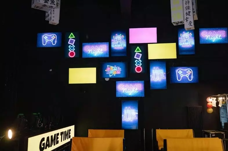
image for illustrative purpose

Visual appeal and user interface design are critical to enhancing player experience in online gaming. Among the many design elements, colour coordination is pivotal in shaping how players interact with the game.
From creating immersive environments to guiding players’ attention, colour can deeply influence gameplay, emotions, and decision-making. But why does colour matter so much in online games?
Establish Mood and Atmosphere
Colour is a powerful tool that evokes emotions, creates ambience, and influences player behaviour. In online gaming, colour coordination plays a crucial role in establishing the mood and atmosphere of a game. By carefully choosing and blending colours, game designers may create immersive environments and improve users' gaming experiences.
For instance, vibrant and energetic colours like red, yellow, and blue are often used in fast-paced arcade games to stimulate excitement and adrenaline. On the other hand, calming colours like green and blue can create a serene and relaxing environment, perfect for puzzles or strategy games.
In the online casino industry, colour coordination is especially important. Casinos often aim to create an atmosphere of luxury, excitement, and trust. It’s fairly common to see combinations of gold, black, and red to evoke feelings of wealth and sophistication. For example, popular slot games in NZ, like Betway’s, often feature opulent themes, like ancient Egypt or classic Hollywood, with colour palettes that reflect these settings.
Game designers may produce visually attractive and captivating experiences that connect with their target audience by knowing the psychology of colour and how it affects player emotions.
Whether it's a casual mobile game or a high-stakes online casino, colour coordination is a fundamental aspect of game design that can elevate the overall quality of the gaming experience.
Enhance Game Mechanics and Functionality
Colour coordination isn’t just about aesthetics; it also plays a functional role in guiding player behaviour. In many games, colour conveys important information at a glance, improving user experience and accessibility.
For example, in first-person shooters or strategy games, red often signifies danger, alerting players to enemies or hazards. Meanwhile, green or blue may indicate health, safety, or energy levels.
These colour cues help players make fast decisions in high-pressure situations without reading lengthy text or examining complex visual details.
In multiplayer games, colour coordination can also differentiate teams or players. Games like League of Legends use colour-coded teams to avoid confusion, allowing players to identify allies and enemies quickly.
Consistent colour choices for health bars, ammunition, and special abilities can make navigation through complex in-game mechanics much smoother, improving player performance and satisfaction.
Support User Interface (UI) and Navigation
Colour plays a crucial role in digital design. It helps designers create visually appealing and user-friendly interfaces. By intentionally using colour, designers may draw attention to key components, enhance navigation, and improve the user experience in general. Effective colour theory can lead to increased user engagement and satisfaction.
The colours used in button prompts, in-game notifications, or inventory systems can make information more digestible.
For example, in MMORPGs like World of Warcraft, skill bars are often colour-coded to indicate the type of ability (healing, damage, defence, etc.), making it easier for players to assess their available actions quickly. Using contrasting colours for speedometers, lap times, and event progress in racing games provides a quick overview of critical gameplay aspects.
Colour contrast is particularly important for readability, helping players spot important information in busy or fast-moving environments. Effective colour choices in UI can reduce cognitive load and streamline decision-making, making the game feel intuitive and enjoyable.
Improve Visual Clarity and Accessibility
Accessibility in online gaming has become a top priority for developers, and colour coordination is a major component in making games more inclusive. Some players may have colour blindness or other visual impairments that make it difficult to distinguish between certain colours or identify important elements in the game.
Designing games with thoughtful colour palettes can mitigate these issues. For example, many games provide colourblind modes, where the game’s default colour scheme is adjusted to make key visuals more distinguishable.
In Overwatch, developers included options to tweak colour schemes for players with different colour vision deficiencies, ensuring they can still fully participate in the game.
Incorporating colour contrast helps players with visual impairments and aids anyone who plays in less-than-ideal lighting conditions. Clear, distinguishable colours provide an all-inclusive experience that accommodates a broader audience.
Conclusion
Colour is a powerful tool that can elevate the gaming experience. By comprehending and applying colour theory efficiently, game designers can produce visually appealing, engaging, and user-friendly games that appeal to players. From establishing mood and atmosphere to enhancing gameplay mechanics and accessibility, colour plays a crucial role in the success of online games.

